8 Common Travel Website Design Mistakes That Can Reduce Bookings
Think about the last time you booked a trip online. You probably had five different browser tabs open, comparing flights, hotels, and local tour operators. You were looking for the perfect getaway, but you were also looking for a seamless experience. Now, think about what made you close some of those tabs without buying.
Your website is your absolute best salesperson. It works 24/7, across every time zone, showcasing the incredible experiences you offer. But if your digital storefront isn’t set up correctly, it might actually be pushing potential customers straight into the arms of your competitors. Even the most stunning photography and the most exciting itineraries can’t save a site that suffers from fundamental travel website design mistakes. If you want your platform to succeed, you need to understand the fundamental user experience design basics that keep visitors engaged.
If your platform makes it hard for users to take the next step, you are leaving money on the table. Let’s dive into why fixing these errors is the absolute fastest way to grow your business, before we look at the specific blunders you need to wipe out.
Why You Must Avoid These Travel Website Design Mistakes
When a traveller visits your site, they are not just looking at a screen; they are looking for a feeling. They want to feel excited about their upcoming adventure, and they want to feel completely safe handing over their credit card details. If your platform feels confusing, clunky, or outdated, that essential sense of trust disappears instantly.
Avoiding common travel website mistakes isn’t just about making your pages look prettier. It is about removing the invisible friction points that cause a user to abandon their cart. Here is exactly why cleaning up your digital design is worth your immediate time and energy:
1. Travellers Have Zero Patience
The modern traveller is highly impatient. If a page takes more than three seconds to load, or if a user can’t find your booking button within a few moments of landing on your page, they will leave. In the digital world, this is called a “bounce.” A poor travel website user experience acts like a closed door. If you are running your platform on WordPress, knowing how to speed up your WordPress travel website is essential to keep people engaged long enough to see what you are selling. By ensuring your site is clean, fast, and easy to navigate, you keep people engaged long enough to actually see what you are selling.
2. Trust is Your Only Currency Online
Unlike a physical store where a customer can look you in the eye and shake your hand, an online business relies entirely on digital credibility. When your site features broken links, confusing layouts, or hidden fees, it signals to the user that your business might not be professional or secure. By prioritising travel website conversion optimisation, you signal to your audience that you care about their time and security, which naturally makes them more comfortable buying from you.
3. It Maximises Your Marketing Budget
Think about it this way: if you spend $500 on ads to get 100 people to your website, but your site layout is so confusing that only one person books, your acquisition cost is incredibly high. However, if you learn how to improve travel website bookings through smart layout choices, you might convert three or four of those same 100 visitors. You don’t need to spend more money on getting more traffic; you simply need to make the traffic you already have work harder for you.
Now that we know exactly what is at stake and why fixing these issues is so critical for your bottom line, let’s pull back the curtain on the actual culprits. It is time to look at some of the mistakes that your platform might have.
8 Common Travel Website Design Mistakes
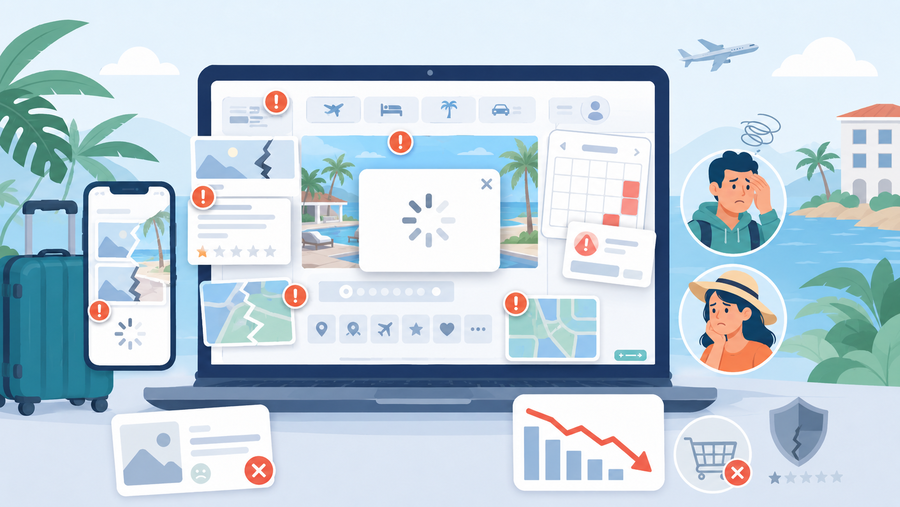
1. Massive, Unoptimized Images That Slow Down Page Speed
Travel is an incredibly visual industry, but uploading huge photo files straight from your camera is one of the most common travel website mistakes that destroys your sales. When a page takes more than three seconds to load because it is trying to download a 10-megabyte photo, travellers will simply hit the back button.
This lagging performance instantly ruins the travel website user experience before guests even see your amazing itineraries. If you want to know how to improve travel website bookings, you must realise that speed matters just as much as beautiful photography.
- Resize first: Scale your images down to a maximum width of 1920 pixels using software before uploading them to your site.
- Compress files: Run every photo through free online tools like TinyPNG or Squoosh to shrink file sizes by up to 80% without losing visual quality.
- Use WebP formats: Switch from traditional heavy PNGs to modern WebP formats, which load much faster on mobile data.
2. A Clunky Mobile Experience That Drives Users Away
Designing your platform solely for desktop computers and assuming it will automatically work well on a phone is one of the costliest travel website design mistakes you can make today. More than half of all global travel traffic originates on mobile devices, meaning travellers are actively trying to book tours or rooms directly from their smartphones.
If your text is too microscopic to read or your layout forces users to pinch and zoom, they will leave your site for a competitor. True travel website conversion optimisation requires prioritising mobile navigation so users can check out smoothly with just a few taps of their thumb.
- Use responsive design: Ensure your website template automatically stacks and shifts content vertically to fit any smartphone screen perfectly.
- Make thumb-friendly buttons: Ensure your “Book Now” buttons are large, clear, and surrounded by plenty of empty space so users don’t accidentally click the wrong link.
- Simplify checkout forms: Remove any unnecessary text fields from your mobile booking forms to make typing on a tiny phone screen effortless.
3. Hidden Pricing and Lack of Transparency
Waiting until the final payment screen to reveal taxes, resort fees, or service charges is a massive blunder. When travellers see a price jump unexpectedly at the end, they feel deceived and will instantly close the tab. This lack of upfront honesty completely derails your travel website conversion optimisation efforts and spikes your cart abandonment rates.
Travellers want to know exactly what they are paying for from the beginning. If your layout hides the true cost, it ruins the trust you built with beautiful photos. Providing clear pricing upfront is one of the easiest ways on how to improve travel website bookings instantly. If you cater to international audiences, learning how to build a multi-currency travel booking website can help show transparent, localised pricing right from the start.
- Show total costs early: Display the full price, including mandatory fees, right on the initial search or package details page.
- Provide a clear breakdown: Use a simple dropdown or sidebar that itemises taxes, base rates, and card fees before checkout.
- State cancellation policies clearly: Put your refund terms right next to the price so users feel safe making a decision.
4. Overly Complicated Checkout Forms
Forcing users to fill out dozens of fields just to secure a spot on a tour or reserve a room is a major mistake. Every extra text box you include, like asking for a middle name, a fax number, or how they heard about you, creates another friction point where a user might give up.
Long, complex forms destroy the travel website user experience, especially on mobile devices, where typing is harder. To keep buyers engaged, your reservation process needs to be as fast and painless as possible. Choosing the right plugin engine, such as comparing WP Hotel Booking vs WooCommerce Bookings, can make a massive difference in streamlining your checkout form structure.
- Stick to essentials: Only ask for absolute necessities like full name, email, phone number, and payment details during the booking phase.
- Use a progress bar: If your checkout requires multiple steps, show a clear visual indicator so users know the end is near.
- Enable guest checkout: Never force a user to create a password-protected account just to complete a quick booking.
5. Confusing Navigation and Poor Site Structure
If visitors cannot figure out how to view your destinations, check available dates, or find your contact information within five seconds, your layout has failed. A cluttered or confusing menu structure frustrates users and makes your business look disorganised and unprofessional.
This is one of those common travel website mistakes that completely hides your best offers. If your itineraries are buried under layers of unnecessary pages, most people will leave before ever finding them.
- Keep menus simple: Use standard, highly predictable labels like “Tours,” “Accommodation,” “About Us,” and “Contact” in your main header navigation.
- Implement a sticky menu: Fix your navigation bar to the top of the screen so it stays visible as users scroll down long pages.
- Add a prominent search bar: Place a clear search function at the top of the homepage so users can jump straight to what they want.
6. Weak or Invisible “Book Now” Buttons
Your call-to-action (CTA) buttons are the most important elements on your platform. If your “Book Now” or “Check Availability” buttons blend into your page’s background colour, are too small, or use vague text like “Submit” or “Click Here,” people won’t click them.
Without clear direction, visitors don’t know what step to take next. Fixing vague CTAs is a foundational rule of travel website conversion optimisation because it clearly guides the user from exploration to purchase.
- Use high-contrast colours: Make your booking buttons a bright, distinct colour that stands out sharply against your website’s main palette.
- Keep them above the fold: Place your primary booking button near the top of the page so users see it without needing to scroll down.
- Use action-oriented language: Stick to direct phrases like “Book Your Tour” or “Reserve Room Now” instead of passive words.
7. Leaving Out Customer Reviews and Social Proof
Travel is a high-trust purchase because customers are buying an experience they cannot try out in advance. If your website lacks real customer reviews, testimonials, or trust badges, potential guests will feel hesitant to trust you with their hard-earned money and vacation time.
Failing to display social proof is one of the top travel website design mistakes that breeds scepticism. Fortunately, it is simple to learn how to add customer reviews to travel website pages to reassure users that their data and vacation time are safe with you.
- Embed trusted reviews: Display live feeds or verified reviews from reputable platforms like TripAdvisor, Google, or Trustpilot directly on your tour pages.
- Show real guest photos: Include a small gallery of actual photos taken by your past customers rather than relying entirely on polished stock images.
- Display secure badges: Show payment security badges and industry certifications near your checkout buttons to reassure users that their data is safe.
8. Overwhelming Walls of Text Instead of Scannable Itineraries
When travellers research a trip, they want to skim through the highlights, daily itineraries, and key details quickly. Dumping massive blocks of unformatted text onto your pages tires out the reader’s eyes and makes it incredibly difficult to find crucial information, like inclusions or trip durations.
A dense, textbook-like layout severely ruins the travel website user experience. To keep potential customers engaged, your content needs to be broken down into highly digestible, visually organised pieces.
- Use bullet points and headers: Break up long descriptions with clear subheadings, short paragraphs, and bullet points for lists.
- Deploy accordion tabs: Use expandable text boxes for detailed day-by-day itineraries so the page stays clean and organised.
- Highlight key facts with icons: Use simple icons to clearly display essential details like trip duration, difficulty level, and group size at a single glance.
Frequently Asked Questions (FAQs)
What is the fastest way on how to improve travel website bookings through simple tweaks?
Remove any unnecessary fields from your booking forms. Every extra question you ask a customer (like asking for their fax number or how they heard about you during checkout) creates a chance for them to give up and close the tab. Keep your forms limited to the absolute essentials: name, email, dates, and payment information.
How do I know if my travel website design mistakes are actually costing me bookings?
The best way to know is by looking at your analytics data. Check your site’s bounce rate (the percentage of people who leave after viewing just one page) and your cart abandonment rate. If you have plenty of visitors coming to your tour or room pages, but almost no one is clicking through to the final payment page, you likely have friction points in your layout or checkout process that are scaring users away.
Where should I start with travel website conversion optimisation if I have a low budget?
You don’t need an expensive web developer to start making improvements. Begin by optimising your image file sizes so your pages load faster, rewriting your call-to-action buttons to be completely clear, and testing your booking form on your own mobile phone. Fixing slow load speeds and mobile display issues costs almost nothing but yields massive returns.
Conclusion
At the end of the day, your travel website shouldn’t just be an online brochure or a collection of pretty vacation photos. It needs to be a seamless, high-performing tool that converts curious browsers into excited travellers. When you eliminate major travel website design mistakes, you instantly make it easier for people to plan, trust, and purchase your experiences.
Remember, the goal of great web layouts isn’t to look overly complicated or flashy; it is to get out of the customer’s way so they can focus on the amazing journey you have put together for them. Take a look at your current site through the eyes of a tired, busy traveller today. Make the necessary tweaks, streamline your checkout process, and watch your reservation numbers begin to climb.
Read more: Top 7 Tour Booking Website Features that you Should Have
You may also like
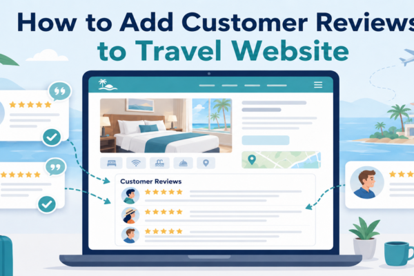
How to Add Customer Reviews to Travel Website
Posted on June 22, 2026When planning a vacation, a weekend getaway, or a guided tour, travellers naturally want reassurance from real people who have already spent their hard-earned money on those experiences. Because they cannot physically test your travel services before purchasing, they look for visual indicators of safety, quality, and reliability. Adding genuine feedback directly onto your
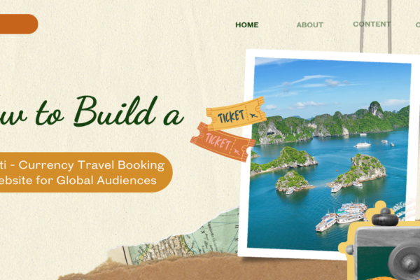
How to Build a Multi-Currency Travel Booking Website for Global Audiences
Posted on June 11, 2026If you have ever managed an international travel agency, boutique tour company, or hotel distribution engine on WordPress, you already know that wanderlust has no borders. Travellers from London, New York, and Tokyo are constantly searching for their next escape. However, the moment an international explorer encounters a checkout page displaying foreign currencies, friction